Graphs can be a very useful tool for conveying information, especially numbers, percentages, and other data. A graph gives the reader a picture to interpret. That can be a lot more efficient than pages and pages explaining the data. Graphs can seem frightening, but reading a graph is a lot like reading a story. The graph has a title, a main idea, and supporting details. You can use your active reading skills to analyze and understand graphs just like any other text. Most graphs have a few basic parts: a caption or introduction paragraph, a title, a legend or key, and labeled axes. An active reader looks at each part of the graph before trying to interpret the data. Captions will usually tell you where the data from(for example, a scientific study of 400 African elephants from 1980to 2005). Captions usually summarize the author's main point as well. The title is very important. It tells you the main idea of the graph by stating what kind of information is being shown. A legend, also called a key, is a guide to the symbols and colors used in the graph. Many graphs, including bar graphs and line graphs, have two axes that form a corner. Usually these axes are the left side and the bottom of the graph. Each axis will always have a label tells you what each axis measures.12-|||-10-|||-8-|||-6-|||-4-|||-2-|||-0-|||-A B C D E-|||-Grade Eamed-|||-Graph 1.Student Performance on Social Stu Quiz Bar Graphs A bar graph has two axes and uses bars to show amounts. In Graph 1, we see that the x-axis shows grades students earned, and the y-axis shows how many students earned each grade. You can see that 6 students earned an A because the bar for A stretches up to 6 on the vertical measurement. There is a lot of information we can get from a simple graph like this (See Graph 1). Line Graphs12-|||-10-|||-8-|||-6-|||-4-|||-2-|||-0-|||-A B C D E-|||-Grade Eamed-|||-Graph 1.Student Performance on Social Stu Quiz A line graph looks similar to a bar graph, but instead of bars, it plots points and connects them with a line. It has the same parts as a bar graph---two labeled axes---and can be read the same way. To read a line graph, it's important to focus on the points of intersection rather than the line segments between the points. This type of graph is most commonly used to show how something changes over time. Here is a graph that charts how far a bird flies during the first five days of its spring migration (See Graph 2). 12-|||-10-|||-8-|||-6-|||-4-|||-2-|||-0-|||-A B C D E-|||-Grade Eamed-|||-Graph 1.Student Performance on Social Stu QuizThe unit of measurement for the x-axis is days. The unit of measurement for the y-axis is kilometers. Thus we can see that, on the first day, the pipit flew 20 kilometers. The line segment goes up between Day 1 and Day 2, which means that the bird flew farther on Day 2. If the line segment angled down, as between Day 4 and Day 5, it would mean that the bird flew fewer kilometers than the day before. This line graph is a quick, visual way to tell the reader about the bird's migration. Pie Graphs A typical pie graph looks like a circular pie. The circle is divided into sections, and each section represents a fraction of the data. The graph is commonly used to show percentages; the whole pie represents 100 percent, so each piece is a fraction of the whole. A pie graph might include a legend, or it might use icons or labels within each slice. This pie graph shows one month's expenses(See Graph 3). Food ﹩25 Movies ﹩12 Clothing ﹩36 Savings ﹩20 Books ﹩7 【小题】When used in a graph, a legend is ______ . A.a guide to the symbols and colors B.an introduction paragraph C.the main idea D.the data 【小题】What is the total number of students who earned a C or better? ______ A.4. B.6. C.10. D.20. 【小题】The bird covered the longest distance on ______ . A.Day 1. B.Day 2. C.Day 3. D.ay 4. 【小题】Which of the following cost Amy most? ______ A.Food. B.ooks. C.Movies. D.Clothing..
Graphs can be a very useful tool for conveying information, especially numbers, percentages, and other data. A graph gives the reader a picture to interpret. That can be a lot more efficient than pages and pages explaining the data.
Graphs can seem frightening, but reading a graph is a lot like reading a story. The graph has a title, a main idea, and supporting details. You can use your active reading skills to analyze and understand graphs just like any other text.
Most graphs have a few basic parts: a caption or introduction paragraph, a title, a legend or key, and labeled axes. An active reader looks at each part of the graph before trying to interpret the data. Captions will usually tell you where the data from(for example, a scientific study of 400 African elephants from 1980to 2005). Captions usually summarize the author's main point as well. The title is very important. It tells you the main idea of the graph by stating what kind of information is being shown. A legend, also called a key, is a guide to the symbols and colors used in the graph. Many graphs, including bar graphs and line graphs, have two axes that form a corner. Usually these axes are the left side and the bottom of the graph. Each axis will always have a label tells you what each axis measures.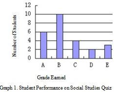
Bar Graphs
A bar graph has two axes and uses bars to show amounts. In Graph 1, we see that the x-axis shows grades students earned, and the y-axis shows how many students earned each grade. You can see that 6 students earned an A because the bar for A stretches up to 6 on the vertical measurement. There is a lot of information we can get from a simple graph like this (See Graph 1).
Line Graphs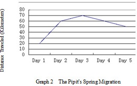
A line graph looks similar to a bar graph, but instead of bars, it plots points and connects them with a line. It has the same parts as a bar graph---two labeled axes---and can be read the same way. To read a line graph, it's important to focus on the points of intersection rather than the line segments between the points. This type of graph is most commonly used to show how something changes over time. Here is a graph that charts how far a bird flies during the first five days of its spring migration (See Graph 2). 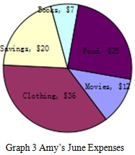 The unit of measurement for the x-axis is days. The unit of measurement for the y-axis is kilometers. Thus we can see that, on the first day, the pipit flew 20 kilometers. The line segment goes up between Day 1 and Day 2, which means that the bird flew farther on Day 2. If the line segment angled down, as between Day 4 and Day 5, it would mean that the bird flew fewer kilometers than the day before. This line graph is a quick, visual way to tell the reader about the bird's migration.
Pie Graphs
A typical pie graph looks like a circular pie. The circle is divided into sections, and each section represents a fraction of the data. The graph is commonly used to show percentages; the whole pie represents 100 percent, so each piece is a fraction of the whole.
A pie graph might include a legend, or it might use icons or labels within each slice. This pie graph shows one month's expenses(See Graph 3).
Food ﹩25 Movies ﹩12 Clothing ﹩36 Savings ﹩20 Books ﹩7
【小题】When used in a graph, a legend is ______ .
A.a guide to the symbols and colors
B.an introduction paragraph
C.the main idea
D.the data
【小题】What is the total number of students who earned a C or better? ______
A.4.
B.6.
C.10.
D.20.
【小题】The bird covered the longest distance on ______ .
A.Day 1.
B.Day 2.
C.Day 3.
D.ay 4.
【小题】Which of the following cost Amy most? ______
A.Food.
B.ooks.
C.Movies.
D.Clothing.
题目解答
答案
| 【小题1】A | 【小题2】D | 【小题3】C | 【小题4】D |
解析
- 考查要点:本题主要考查学生对不同图表类型(条形图、折线图、饼图)的理解能力,包括识别图例、分析数据、计算总和、比较数值等。
- 解题核心:
- 图例作用:明确图例在图表中的功能。
- 条形图数据计算:通过条形高度判断具体数值并求和。
- 折线图趋势分析:通过交点位置判断最大值。
- 饼图比例比较:通过金额大小直接比较。
第1题
关键点:图例的定义。
根据原文“A legend, also called a key, is a guide to the symbols and colors used in the graph”,图例的作用是解释图表中的符号和颜色。
第2题
关键点:条形图数据求和。
- 条形高度对应数值:A(6人)、B(4人)、C(10人)、D(2人)、E(0人)。
- “C或更好”包含A、B、C三个等级:总人数为 $6 + 4 + 10 = 20$。
第3题
关键点:折线图最大值判断。
- 交点位置对应数值:Day 1(20 km)、Day 2(30 km)、Day 3(40 km)、Day 4(35 km)、Day 5(30 km)。
- 最高点为Day 3。
第4题
关键点:饼图金额比较。
- 各部分金额:Food($25)、Movies($12)、Clothing($36)、Savings($20)、Books($7)。
- 最大值为Clothing($36)。